
2D
The task for this project is to create a logo design for a band called CMCB (Callum Mosophs Clag Button). At first, I researched some logos that I liked, but later I realized that the name of the band sounded more like a folk band. After conducting some research, I discovered a sub-genre in folk known as anti-folk, and I felt that the name CMCB would fit perfectly within this genre.
Research
|
Antifolk is a music genre that emphasises songwriting rather than technique and personality over polish. Some consider it a fusion of punk and folk, while others see it as the evolution of folk. However, some believe the genre is so diverse and challenging to define that it is more of a music scene than a genre.
http://www.antifolk.com/what-is-antifolk/ |
“Antifolk was and will always be an opportunity for anyone to get up and make a ridiculously holy racket, whatever that entails. An opportunity to become you on your own terms with all the rewards and consequences.”
– Grey Revell |


Looking more at AJJ

|

|

|
Looking at Runes
I researched the meaning behind the band name. Callum means peace or dove, and "clag" may be from Norse.

Moodboards


Logos
|
|

|
|
|

The materials used in the project were pencil, fine liners, paint pens, and acrylic paint.
|


The logo was inspired by cutting out different shapes and assembling them together.


Making Type Out Of Sticks
I collected some sticks from outside to create the letters for the band 'CMCB'. After that, I photographed the letters and used Illustrator to convert them into a vector image. Then, I cleaned up the image and experimented with different colours.


|

|

|

|

|


|

|

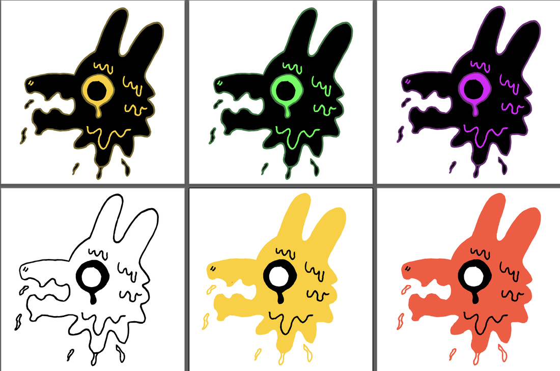
Experimented with different colours on the mockups.

|

|


inspired to make clay pin badges as merch for the band


This pin was made out of polymer clay, baked and then hand painted


After reviewing, I realised that clashes with the overall vibe of the logo. Looking at Zoe's lovey book "HAND JOB" shows a lot of hand-drawn and hand-created fonts.

Upon review of my designs, I notice a Saul Bass influence in some. These designs utilise bold colors without being overly harsh. I believe this is a positive direction to take.

|

|

looking back on old designs to see if it sparks interest


|

|

|

|

Making patterns using items from the logo

|

|


